Mastering Animations in React: Building a Moving Highlight Component
Short description
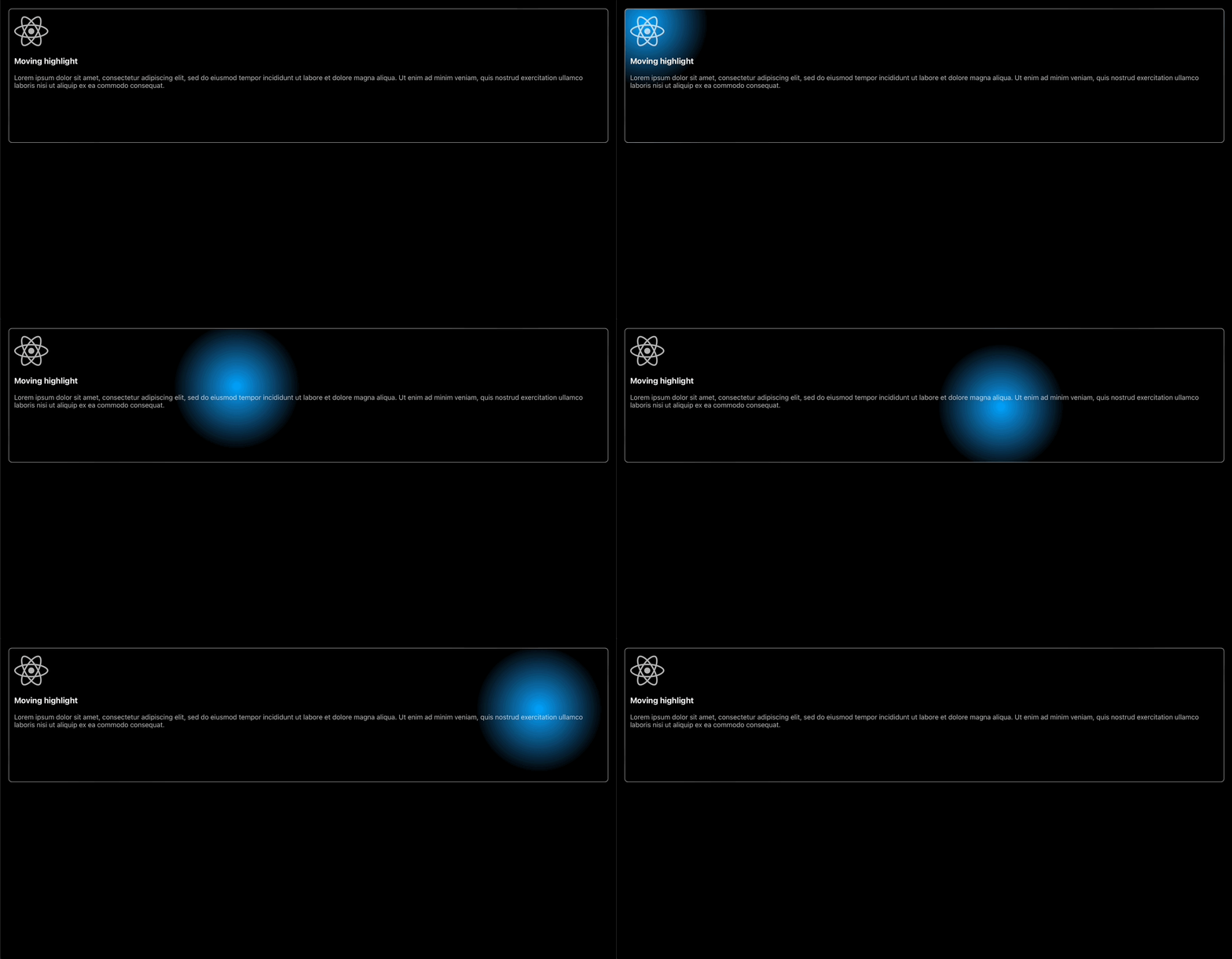
Once when I was on the JetBrains site, I noticed a hover effect that caught my eye. This effect follows the movement of the mouse inside a box and a highlight appears around the cursor. As a Frontend Developer, I immediately had the idea to create this trick myself. I created it in React, because that is the framework I like the most. Now let's see how I made the implementation this component! The project repo can be found on GitHub, in the links at the end of this article.
But what exactly are we talking about? Here's a screenshot from the JetBrains site, the link is also at the end of the article.

How does it work?
First, a summary of how the magic works: is actually a function that continuously follows the movement of the mouse inside the box. So need to be able to determine the exact position of the cursor. And display the highlighting around the cursor. Which we will achieve by changing the background of the Box itself.
Let's get started!
As a first step, I created a new React application. I've also included TypeScript in it.
npx create-react-app moving-highlight --template typescript
Then install the necessary libraries that will be used during development. I will now use Styled Components for CSS.
hnpm install --save styled-components
We also want to use icons, for which I chose Fontawesome.
npm install --save @fortawesome/fontawesome-svg-core
npm install --save @fortawesome/free-brands-svg-icons
npm install --save @fortawesome/free-solid-svg-icons
npm install --save @fortawesome/free-regular-svg-icons
Once these steps are done, let's do a little cleanup of our file structure. Delete the App.css file, because as I mentioned we will use Styled Components. Feel free to do the same with the logo.svg file. We won't use this one either, as we will have the Fontawesome icons there. And convert the App.tsx file as follows:
import React from 'react'

const App = () => {
  return (
    <div></div>
  )
}

export default App
Then create a folder called components inside the src folder. And inside the components folder, create a file called MovingHighlight.tsx, which will be the component we want to create.
We initialize our component as follows:
const MovingHighlight = () => {
  return (
    <div>
      <h3>Moving highlight</h3>
      <p>
        Lorem ipsum dolor sit amet, consectetur adipiscing elit, sed do eiusmod tempor incididunt ut labore et dolore magna aliqua. Ut enim ad minim veniam,
        quis nostrud exercitation ullamco laboris nisi ut aliquip ex ea commodo consequat.
      </p>
    </div>
  )
}

export default MovingHighlight
Then import it into our App.tsx file:
import React from 'react'
import MovingHighlight from './components/MovingHighlight'

const App = () => {
  return (
    <div>
      <MovingHighlight />
    </div>
  )
}

export default App
And then add the import for the CSS:
import styled from 'styled-components'
Create a Styled Component called AppContainer with the following CSS rules. Then apply the AppContainer to the div we created earlier.
import React from 'react'
import MovingHighlight from './components/MovingHighlight'
import styled from 'styled-components'

const AppContainer = styled.div`
  min-height: 100vh;
  background: rgb(0, 0, 0);
  padding: 1.25rem;
`
const App = () => {
  return (
    <AppContainer>
      <MovingHighlight />
    </AppContainer>
  )
}

export default App
Next, let's get down to the nitty-gritty of adding logic and style to our component.
Let's start with CSS. Our outermost container should be the following and don't forget imports:
import styled from 'styled-components'
import { FontAwesomeIcon } from '@fortawesome/react-fontawesome'
import { faReact } from '@fortawesome/free-brands-svg-icons'
const Box = styled.div`
  color: rgb(255, 255, 255);
  border: 1px solid rgba(255, 255, 255, 0.7);
  border-radius: 0.5rem;
  padding: 0.75rem;
  cursor: default;
  max-height: 18rem;
`
Then for the icon, the following:
const StyledIcon = styled(FontAwesomeIcon)`
  opacity: 0.7;
`
And finally, for the paragraph:
const StyledText = styled.p`
  opacity: 0.7;
`
Use the Styled Components and add the icon:
return (
    <Box>
      <StyledIcon icon={faReact} size="5x" />
      <h3>Moving highlight</h3>
      <StyledText>
        Lorem ipsum dolor sit amet, consectetur adipiscing elit, sed do eiusmod tempor incididunt ut labore et dolore magna aliqua. Ut enim ad minim veniam,
        quis nostrud exercitation ullamco laboris nisi ut aliquip ex ea commodo consequat.
      </StyledText>
    </Box>
)
Here comes the magic
For Box, we will need a useRef, which will be a reference value and an onMouseMove event, which calls a function when moving the mouse pointer over our Box element, and an onMouseLeave event, which calls a function when moving the mouse pointer out of our Box.
These will require the following imports:
import { useState, useRef, MouseEvent } from 'react'
useRef: we need this to determine the position of the mouse inside the Box.
const boxRef = useRef<HTMLInputElement>(null)
For the two events, define the following 3 useState:
- The bgColor is the heart of it all, as we want to manipulate the background of the Box as we move the mouse over it.
- And left and top will be useful to define the position of the cursor.
const [bgColor, setBgColor] = useState<string>('rgb(0, 0, 0)')
const [left, setLeft] = useState<number>(0)
const [top, setTop] = useState<number>(0)
onMouseMove: when you move the mouse inside the Box, it will call a function.
Define the following variables:
- originalColor: the original background color, in this case black.
- gradientColor: the Highlight color.
- gradientSize: the size of the Highlight.
- x: the value of left will be the number of pixels the upper left corner of the Box element is offset to the left. Then subtract this left value from the X (horizontal) coordinate (in pixels) at which the mouse was clicked, relative to the left edge of the entire document.
- y: the value of the top will be the distance of the outer border of the Box element relative to the inner border of the top of the offsetParent, the closest positioned ancestor element. Then subtract this left value from the Y (vertical) coordinate in pixels of the event relative to the whole document.
- xy: and from the last two we get the exact position of the cursor.
Finally, change the background of the Box depending on the cursor position, for this, we will use a radial gradient.
const onMouseMoveHandler = (e: MouseEvent<HTMLDivElement>) => {
    const originalColor = 'rgb(0, 0, 0)'
    const lightColor = 'rgb(0,163,255)'
    const gradientSize = 150

    setLeft(boxRef.current?.offsetLeft ?? 0)
    const x = e.pageX - left

    setTop(boxRef.current?.offsetTop ?? 0)
    const y = e.pageY - top

    const xy = x + ' ' + y

    setBgColor(
      '-webkit-gradient(radial, ' + xy + ', 0, ' + xy + ', ' + gradientSize + ', from(' + lightColor + '), to(rgba(255,255,255,0.0))), ' + originalColor
    )
}
onMouseLeave: when the mouse leaves the Box, the highlight should be removed. This is very simple, just change the background color back to its original color.
const onMouseLeaveHandler = () => {
    setBgColor('rgb(0, 0, 0)')
}
Add the attributes and events to the component:
- The background css rule for style attribute, which will be set to bgColor state.
- The ref attribute to the previously defined boxRef.
- The onMouseMove event to the onMouseMoveHandler.
- And for the onMouseLeave event, onMouseLeaveHandler.
return (
    <Box style={{ background: bgColor }} ref={boxRef} onMouseMove={(e: MouseEvent<HTMLDivElement>) => onMouseMoveHandler(e)} onMouseLeave={onMouseLeaveHandler}>
        <StyledIcon icon={faReact} size="5x" />
        <h3>Moving highlight</h3>
        <StyledText>
            Lorem ipsum dolor sit amet, consectetur adipiscing elit, sed do eiusmod tempor incididunt ut labore et dolore magna aliqua. Ut enim ad minim veniam,
            quis nostrud exercitation ullamco laboris nisi ut aliquip ex ea commodo consequat.
        </StyledText>
    </Box>
)
We're (almost) done!

Make our application responsive by making the following changes in App.tsx:
const AppContainer = styled.div`
  min-height: 100vh;
  background: rgb(0, 0, 0);
  display: grid;
  grid-template-columns: repeat(auto-fit, minmax(18.75rem, 1fr));
  gap: 1.25rem;
  padding: 1.25rem;
`
Plus add three more times our component:
return (
    <AppContainer>
      <MovingHighlight />
      <MovingHighlight />
      <MovingHighlight />
      <MovingHighlight />
    </AppContainer>
)
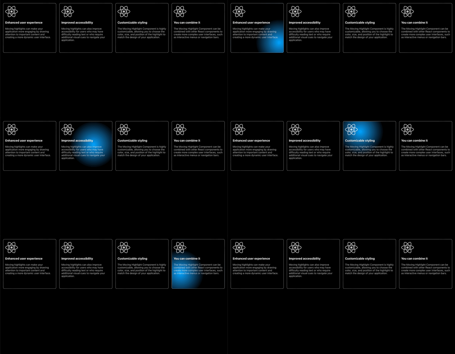
The final result
